Examples When Book Covers Did Not Do Enough Justice To The Source Material
Book covers should do more than just sit pretty on a shelf. They’re the first handshake between a book and its reader, and in a world saturated with content, that handshake needs to mean something.
But I kept noticing this pattern: even great books sometimes get stuck with covers that totally miss the mark. Not just aesthetically, but conceptually.
What really fascinates me is why this happens. It’s not always just bad design—sometimes it’s the result of commercial pressure, cultural blind spots, or a misunderstanding of the book’s tone or genre.
And when that happens, especially to deeply layered, literary works, it’s not just a missed opportunity—it’s misleading.
In this post, I’m diving into cases where the cover design clashed with the essence of the source material. We’re going beyond surface-level critiques to unpack what went wrong—and what that tells us about the publishing industry.
Times When Covers Mislead The Readers
I used to think a bad cover was just a matter of taste—until I started digging into how many of them actually distort the entire reading experience. And once you see it, you can’t unsee it.
Take Sylvia Plath’s The Bell Jar, for instance. In more than a few editions, especially from the 2000s onward, we’ve gotten covers that look like ads for a vintage fashion line.
You know the ones—pink hues, close-ups of mascaraed eyes, soft-focus photography. But this isn’t a story about glamor or aesthetics. It’s a deeply introspective, often bleak account of mental illness and identity unraveling under societal expectations.
Packaging that book like it’s a romantic drama does more than misrepresent—it erases the grit that defines it.
Another offender?
Jean Rhys’ Wide Sargasso Sea. I came across a reprint that featured this lush, tropical-looking cover with a stylized silhouette of a woman in a dress—beautiful, yes, but oddly romanticized.
What’s missing is the tension, the colonial commentary, and the psychological fragmentation that sits at the heart of Rhys’ narrative. It softens the trauma.
Then there’s the genre confusion—books that get dressed up like something they’re not. A Clockwork Orange sometimes gets slapped with graphic-heavy, minimalist covers that scream “high-tech dystopia,” but ignore the linguistic brilliance of Nadsat and the philosophical dilemma at its core.
It’s not just about youth violence—it’s about agency, conditioning, and the limits of free will. A minimalist design might look cool, but when it strips away that complexity, it’s not just misleading—it’s flattening.
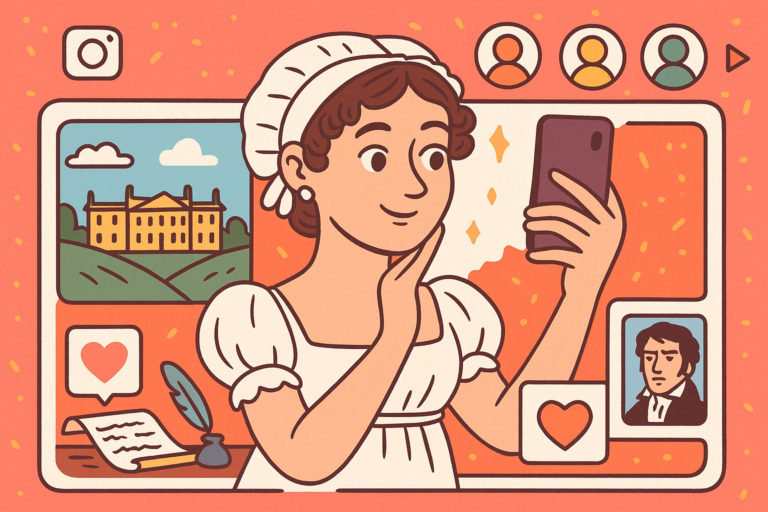
And let’s not forget the issue of temporal disconnect. Jane Austen novels often get ultra-modern illustrated covers to appeal to younger readers, but there’s a risk: modernizing the aesthetic can dislodge the reader from the world Austen built.
If you open Persuasion expecting a sassy rom-com based on the cover, the slow-burning melancholy inside might feel like a bait-and-switch.
The common thread here? These covers may sell, but they often fail to respect the emotional, political, or psychological scaffolding of the work itself. And for a reader—especially a first-timer—it shapes expectations in ways that can dull or distort the reading experience.
As someone who’s spent a good chunk of time researching this, it’s clear: context matters, and when covers ignore it, everyone loses.
Let’s look at some notable examples now.
1. The Bell Jar by Sylvia Plath

Let’s start here because this one always hits a nerve. Some newer covers make The Bell Jar look like it belongs in the YA romance section. Think retro lipstick motifs, delicate flowers, soft pink tones—it’s aesthetic, but in the most Instagrammable way possible.
The problem?
It whitewashes the brutal reality of mental illness and depression that Plath explores with raw vulnerability.
This isn’t a story about being “a sad girl”; it’s about a young woman’s descent into psychiatric crisis in a society that offers her little to no space to exist authentically. The glamorized visuals do a disservice by framing Esther Greenwood’s pain as some sort of melancholic chic.
2. Of Mice and Men by John Steinbeck
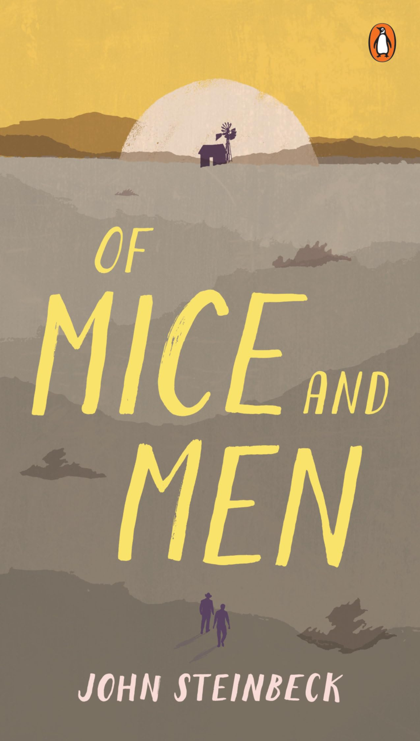
Some editions feature idyllic farmland and wheat fields basking in golden light. Peaceful?
Sure. But Of Mice and Men is anything but tranquil.
It’s a tragedy loaded with social commentary about disability, loneliness, violence, and the failure of the American Dream.
These soft-focus pastoral scenes suggest nostalgia or a feel-good rural tale, when in reality, the story ends in gut-wrenching despair. What’s worse, the pastoral lens erases the class struggle and systemic oppression that Steinbeck spends the entire book trying to highlight. If the cover primes readers for comfort, they’re walking straight into emotional whiplash.
3. American Psycho by Bret Easton Ellis
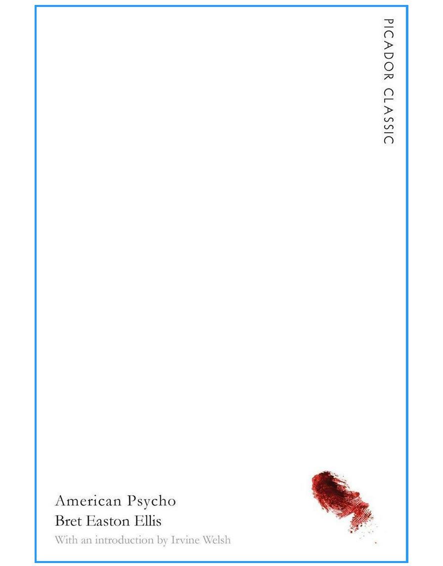
This one’s deceptive in a different way. One UK edition went super minimalist—a white cover with a tiny splash of red.
Visually striking?
Totally. But also totally misleading.
This isn’t just a story about a sociopath doing violent things—it’s a razor-sharp satire of consumerism, masculinity, and 1980s moral decay.
The minimalist approach turns the novel into a vibe, and not in a good way. By stripping out the chaos and grotesque absurdity of the book, the design feels almost complicit in the soulless culture the novel is trying to critique.
4. The Great Gatsby by F. Scott Fitzgerald
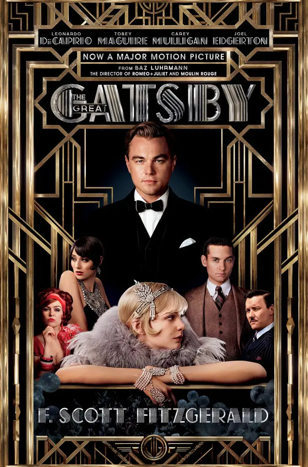
Yes, the one with Leonardo DiCaprio on the front.
Look, I get the marketing logic—it was a major movie release. But this version shifts the spotlight from the text to the celebrity, and that’s where the problem lies.
The cover reads like a promotional poster, not a window into Fitzgerald’s razor-sharp dissection of wealth, obsession, and the rot behind the glitz. Plus, the reader now enters the story with a specific face in mind, making it harder to experience Gatsby as a symbol rather than just Leo in a tux.
5. A Clockwork Orange by Anthony Burgess

Some editions take an ultra-abstract route—black-and-white minimalism, gears and clocks, even strange doodles that feel like album art. It’s an artsy choice, but one that completely ignores the linguistic and psychological innovation that makes this novel so iconic.
Burgess created an entirely new dialect—Nadsat—and crafted a chilling meditation on free will, authority, and moral conditioning.
When the cover leans too hard into aesthetic abstraction, it loses the grit and cultural unease that’s central to the story. Worse, it often signals “dystopian sci-fi,” which this book doesn’t neatly fit into.
Honorable Mentions:
- Pride and Prejudice with cartoonish covers that feel more like a Bridgerton spinoff.
- Frankenstein with monster-movie visuals that ignore the philosophical heart of the book.
- To Kill a Mockingbird with cutesy illustrations that water down its racial and moral tension.
These aren’t just “bad covers.” They’re cases where the design actively undermines or misrepresents the content. And that matters—a lot. Because for many readers, especially first-timers, the cover sets the tone for everything that follows.
Design Constraints and Commercial Realities
Alright, so here’s where things get a little more complex—and, to be fair, more empathetic toward the people behind these decisions.
Because while it’s easy to blame designers or publishers, the truth is: book cover design lives at the intersection of art, commerce, and constraint.
1. Covers Don’t Exist in a Vacuum
A lot of the decisions that frustrate us on the outside are the result of layers of pressure from the inside.
Designers aren’t just creating a beautiful image—they’re trying to please multiple stakeholders: publishers, marketing teams, sales reps, and even big-box retailers.
Let’s say a designer knows the book deals with heavy topics—mental health, abuse, racism—but is told to make it “appeal to a young adult market.”
Suddenly, the goal isn’t fidelity to the text—it’s shelf appeal at Target. That’s not necessarily laziness; it’s business. And unfortunately, nuance doesn’t always win.
2. Genre Tagging and Mislabeling
This happens a lot.
Especially with literary fiction that crosses genres or defies traditional storytelling formats. Publishers often want to “fit” a book into a recognizable market: Is it romance?
Historical fiction?
Dystopian?
Coming-of-age?
When the answer is “kind of all of the above,” covers tend to default to the most commercially friendly category—even if it’s inaccurate. This is how we get Frankenstein with horror-movie imagery or Wide Sargasso Sea with beachy romance aesthetics. The visuals serve a classification system more than the content.
3. The International Edition Problem
This one’s fascinating. In some markets, particularly with translated works, the original context can be totally lost.
I saw an Italian edition of The Trial by Kafka with a bright red cover and giant comic-style text—like a political thriller. Absolutely wild.
Why? Because the cover brief was made locally, by people who might not have had the cultural or philosophical framework to understand the existential dread of Kafka’s writing. International editions often reflect the market’s genre biases, not the book’s deeper meaning.
4. Time and Budget
Book designers often have ridiculously short timelines and tight budgets. We’re talking days, not weeks, and often with very little input from the author—especially in larger publishing houses.
That means a lot of covers are made based on a short brief, a sample chapter, or even a marketing blurb. It’s design by inference.
And if that brief is wrong, or if the book’s tone is hard to capture visually? You end up with a beautifully designed cover that has absolutely nothing to do with what’s inside.
5. When “Bad” Covers Go Viral
Ironically, some of the worst offenders end up becoming iconic. The Lolita cover with the heart-shaped sunglasses?
It’s everywhere—even though it’s completely inappropriate. That version has taken on a life of its own, divorced from the book’s actual themes.
Same with The Great Gatsby’s movie tie-in. People now associate that visual with Gatsby as a cultural moment—not a novel. It’s like the design rewrote the book in the public imagination. And once that happens, the original message starts to fade.
So no, not every bad cover is the result of cluelessness. Sometimes it’s a calculated compromise. But that doesn’t make the result any less frustrating—especially when you know how much richness, complexity, and intention is inside the book.
Finally….
So yeah, book covers matter way more than we sometimes give them credit for. They’re not just visual accessories—they’re invitations, promises, even arguments about what kind of story lies ahead.
When those promises are off-base, it changes how people read. Or whether they read at all.
If we want readers to engage with literature deeply, we’ve got to start treating the cover as part of the story—not just the packaging.
And hey, maybe if more of us keep calling this stuff out, we’ll get fewer pink, glittery Bell Jars and more covers that respect the power of the text inside.


